CoType Foundry
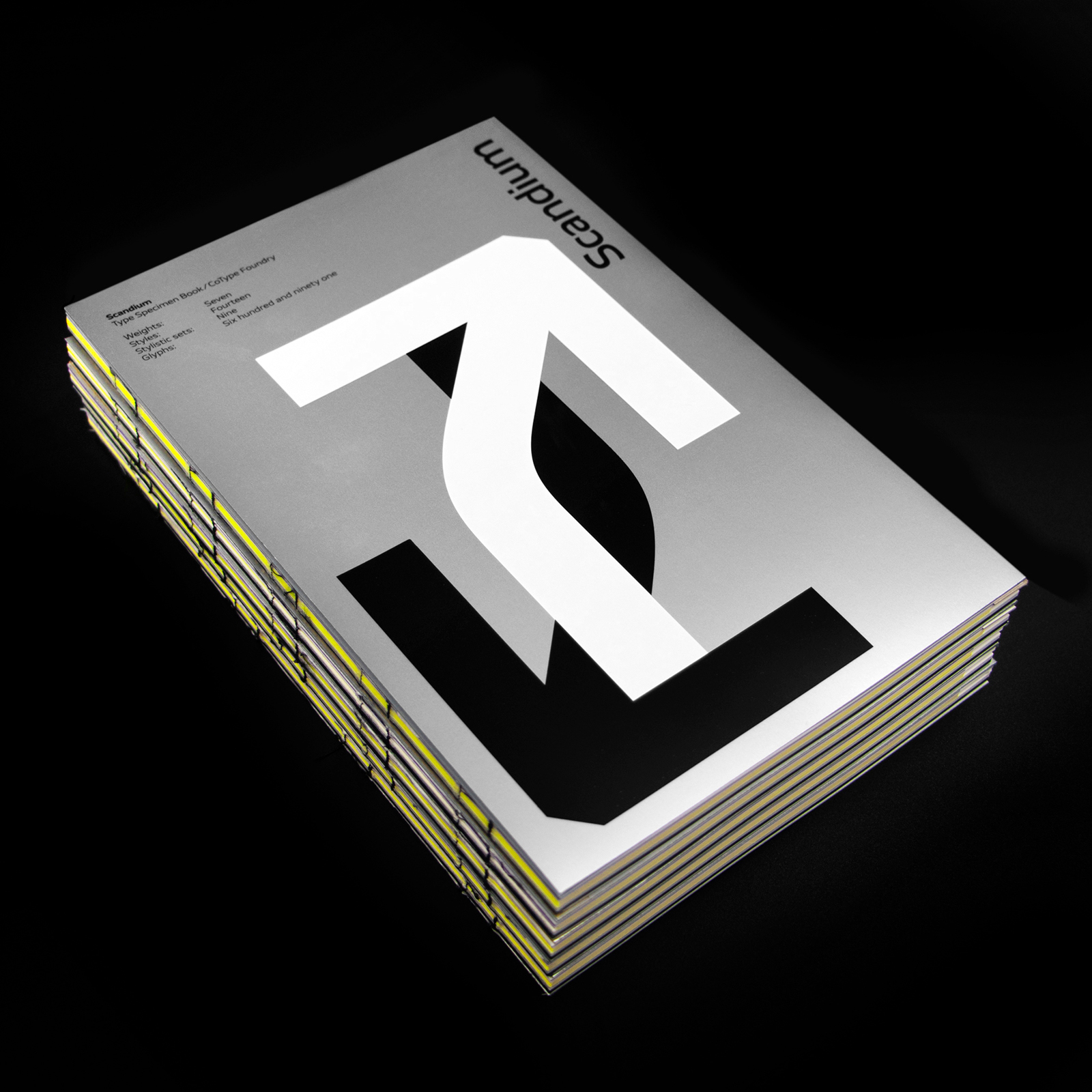
Scandium Type Specimen Book
A vibrant narration that
combines performance with purpose

Context
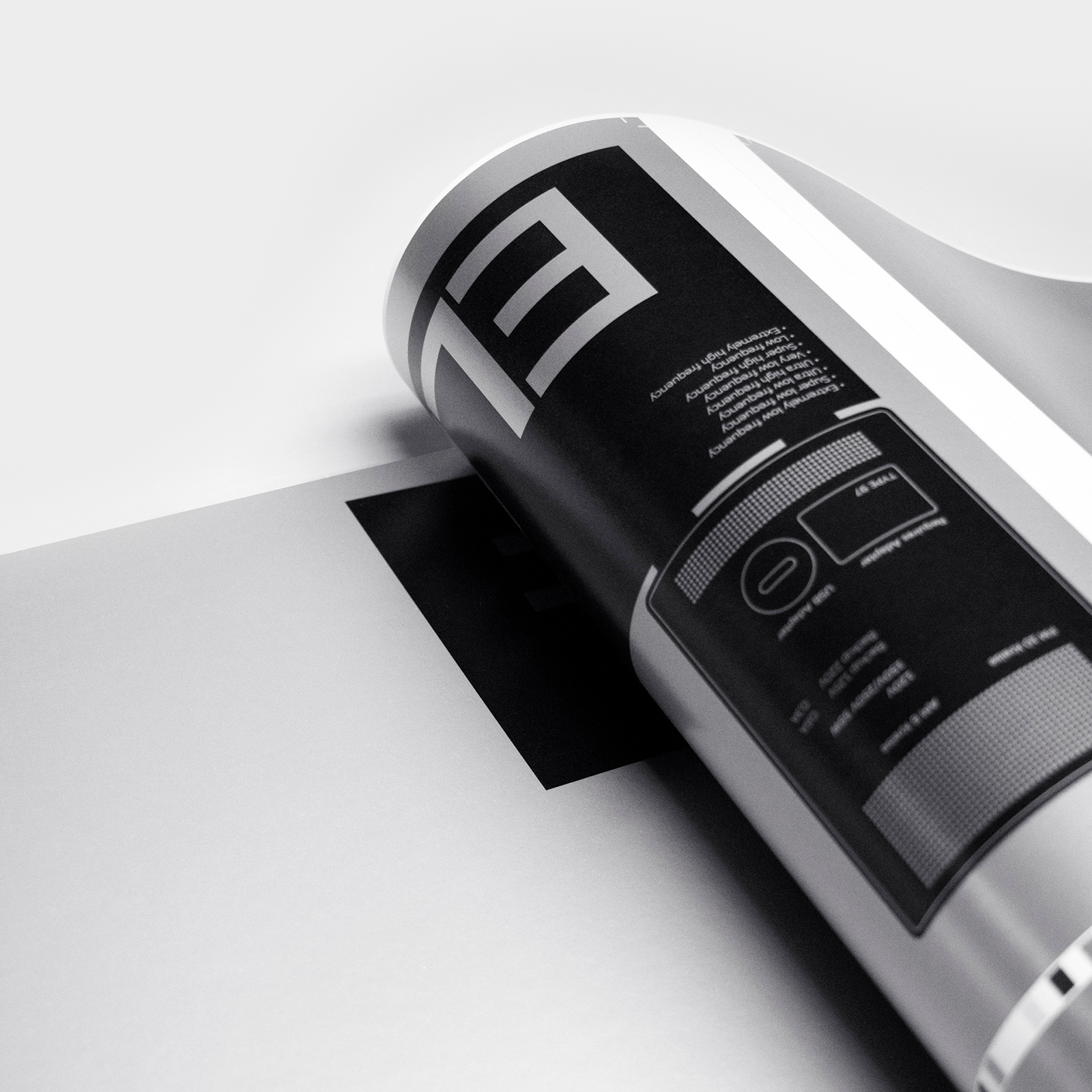
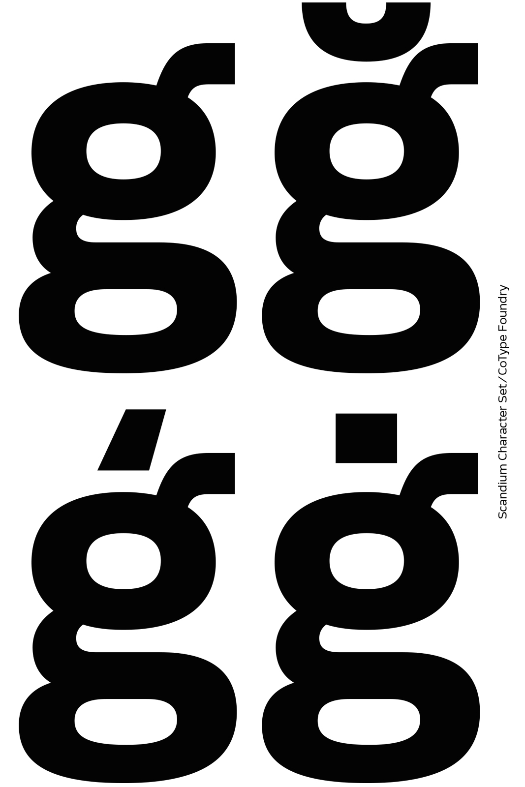
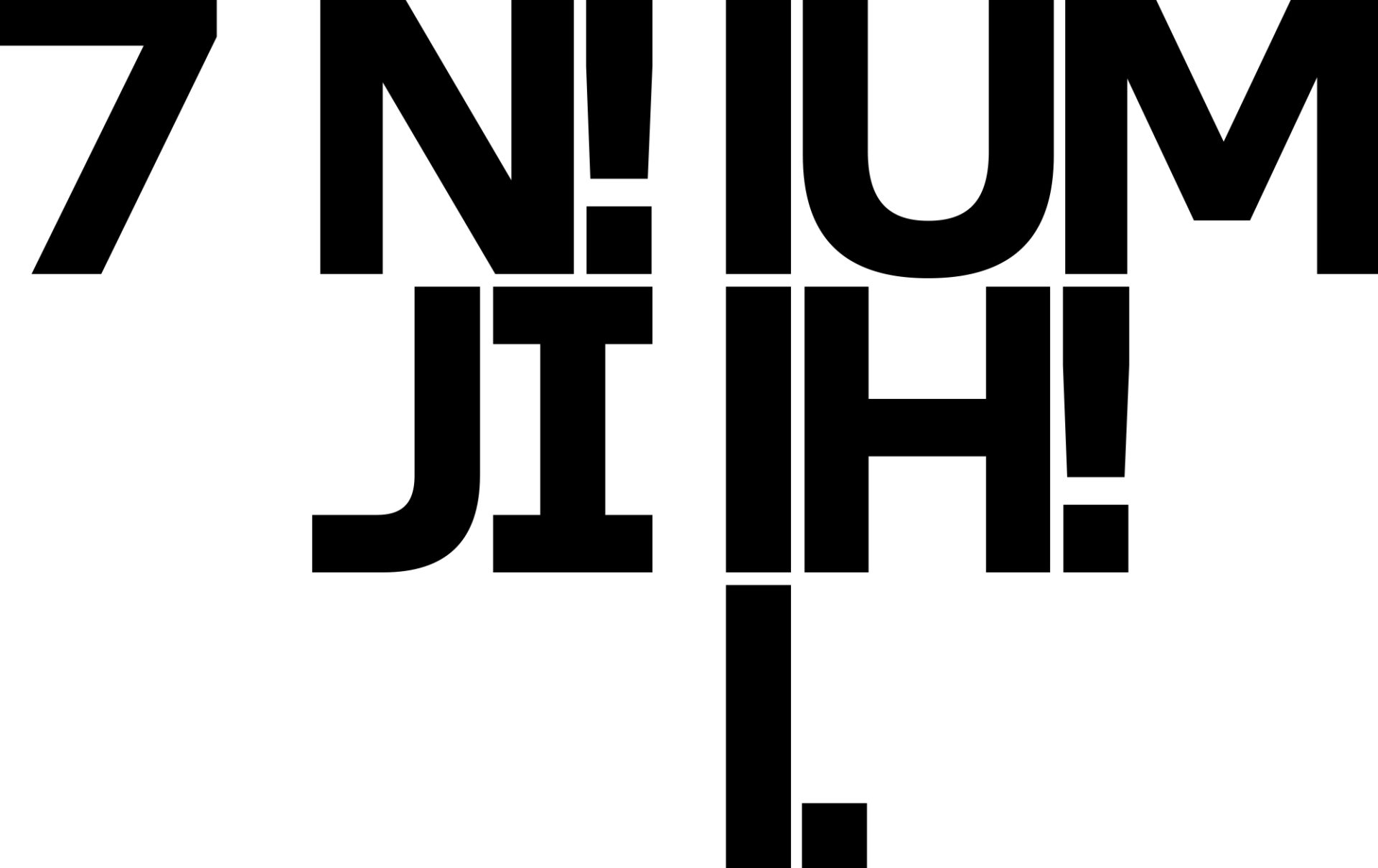
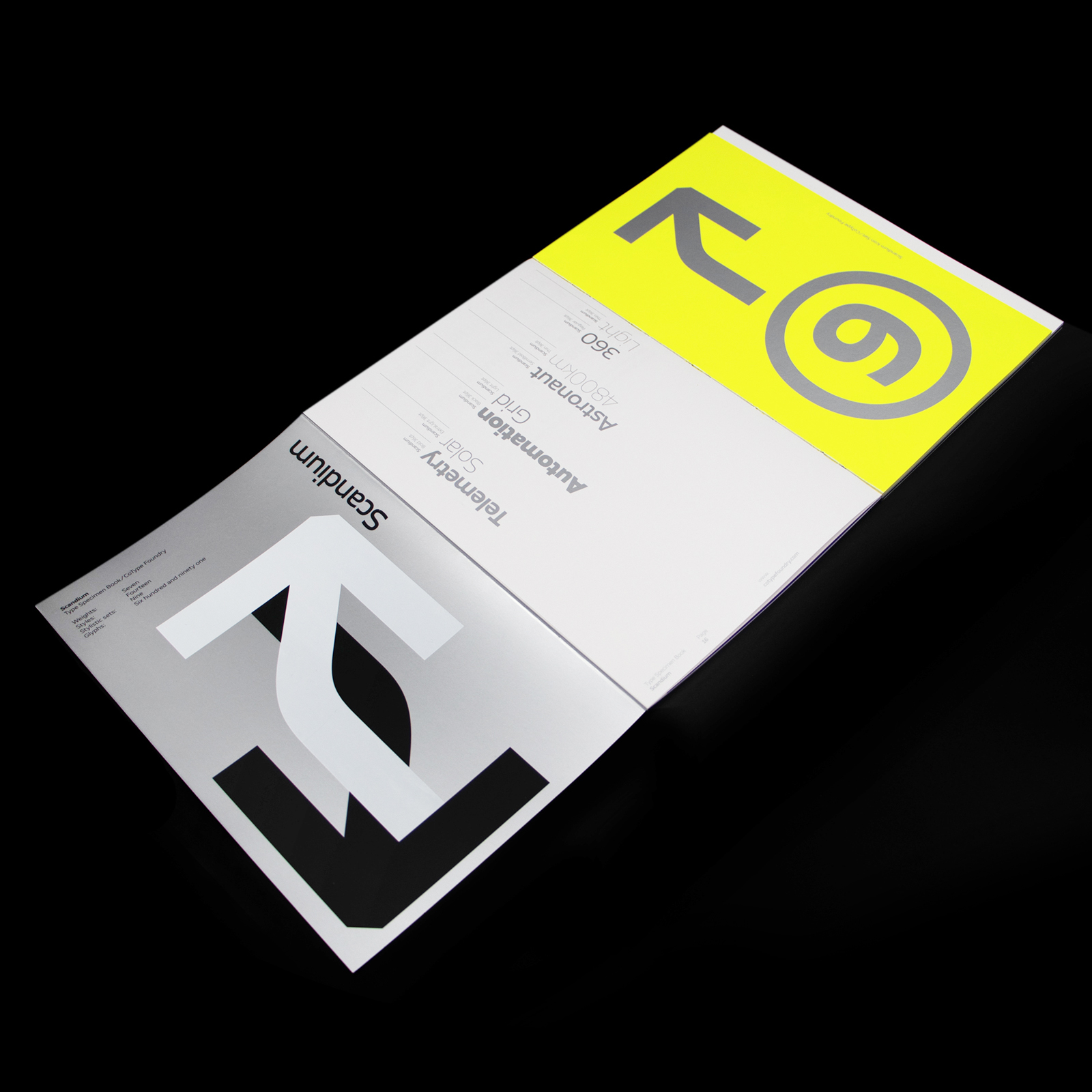
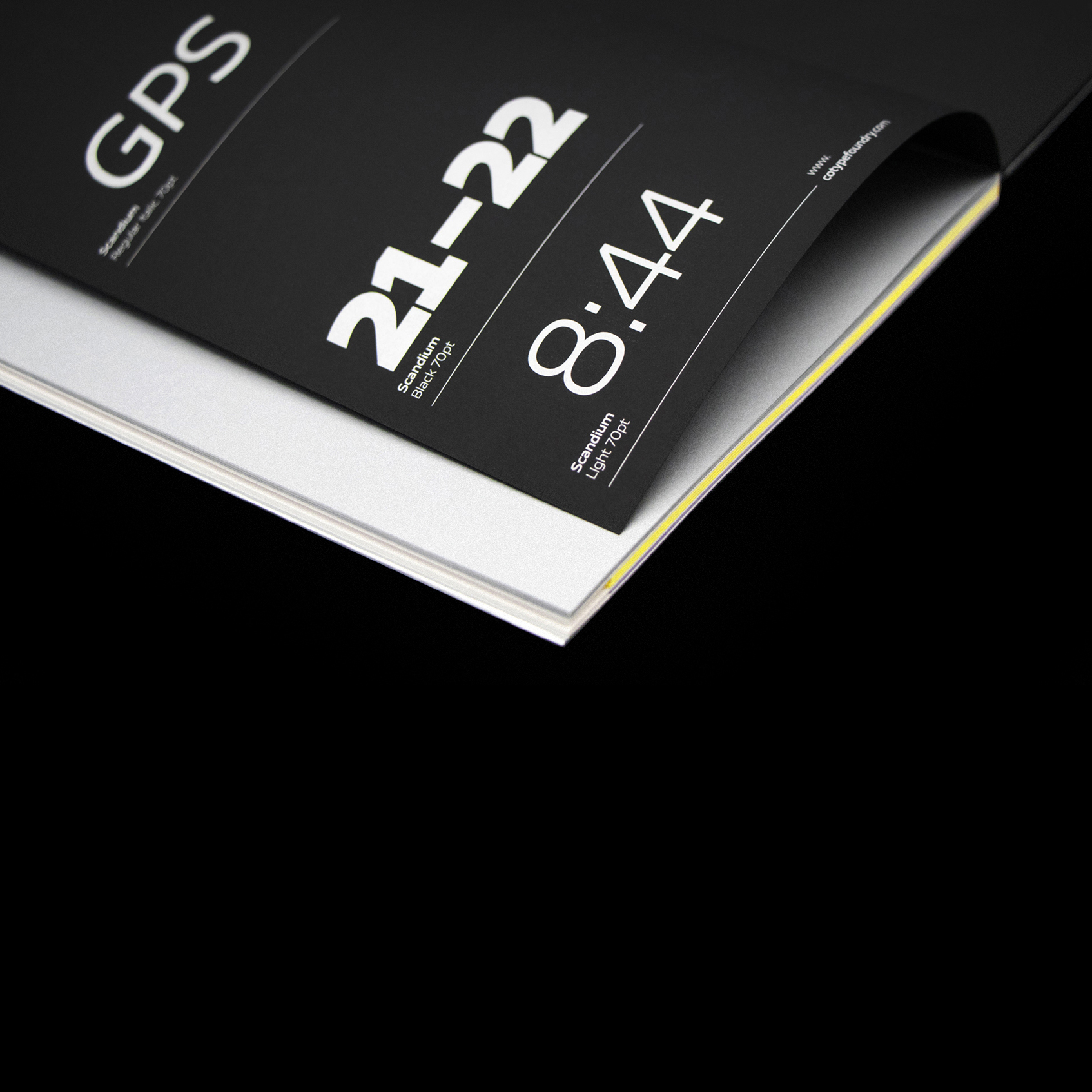
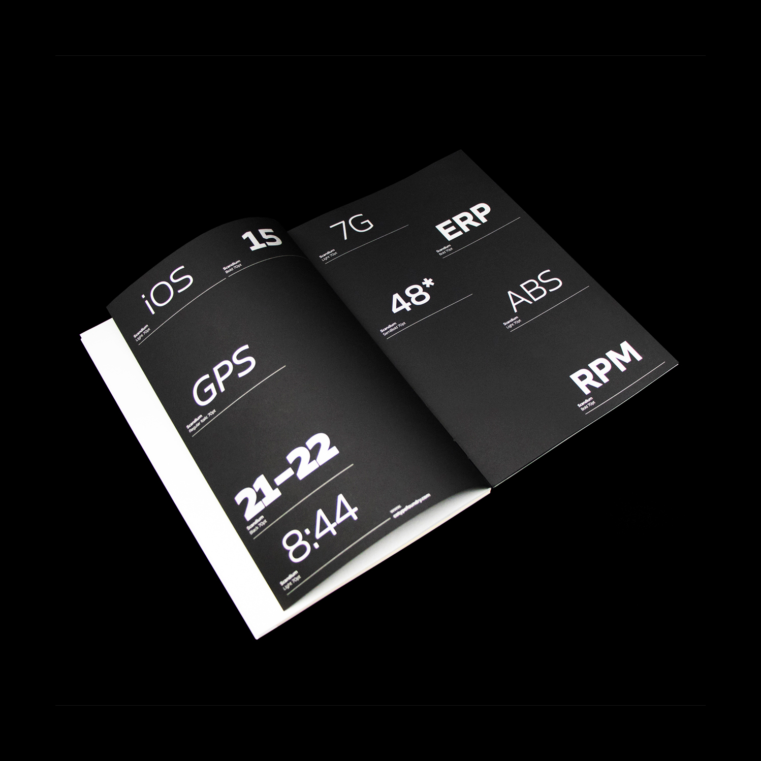
Scandium is a contemporary sans with open shapes and a technical vibe inspired by the needs of the automotive industry, openness, performance, and style. With its modestly squared curves, high x-height and vertical terminals, Scandium marries performance with purpose and is designed to look good both on-screen and in print. This type family seeks to fulfill the needs of designers looking to create a purposeful look for anything from automotive brands to space travel and aviation, even for luxury watches. Across all its 7 weights, Scandium looks self-assured and functional, without ever seeming bland or overly constructed. The Scandium family comes with a large set of icons, which relates back to the desire for it to be used within in-car entertainment systems. ?
Outcome
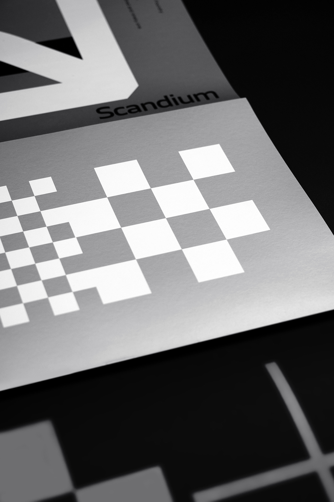
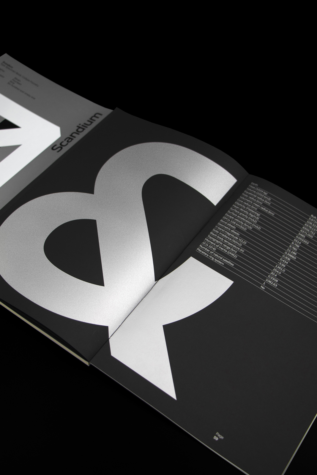
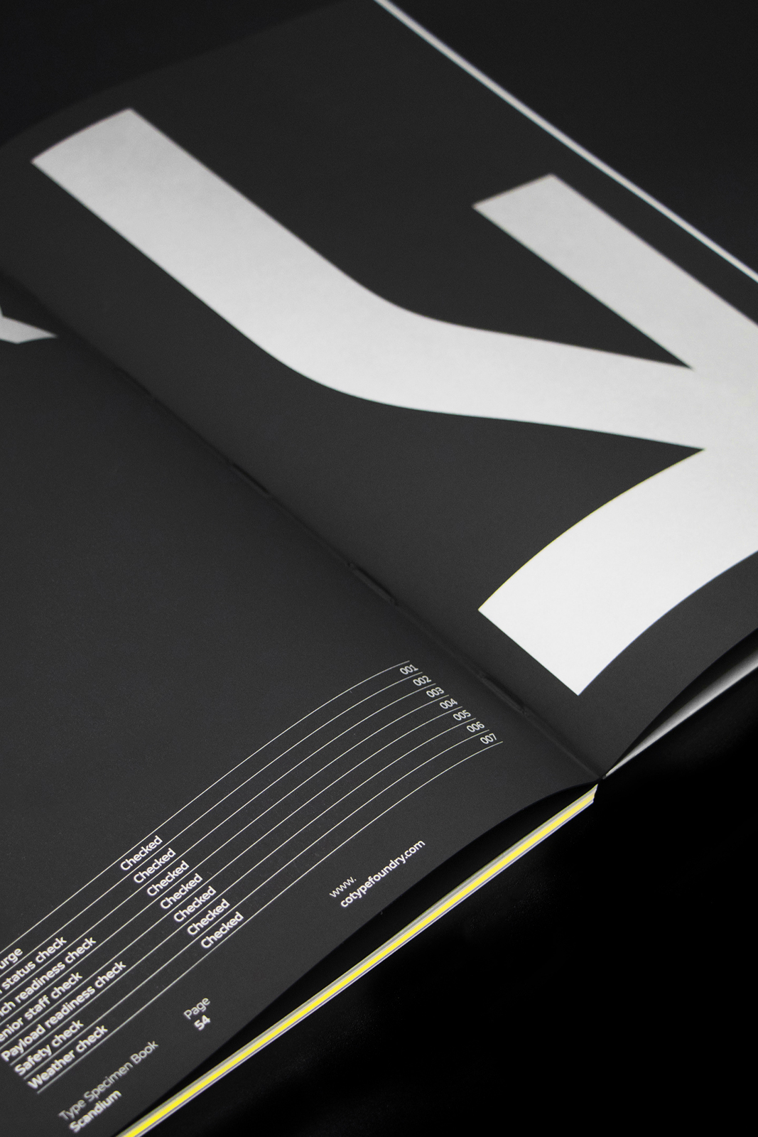
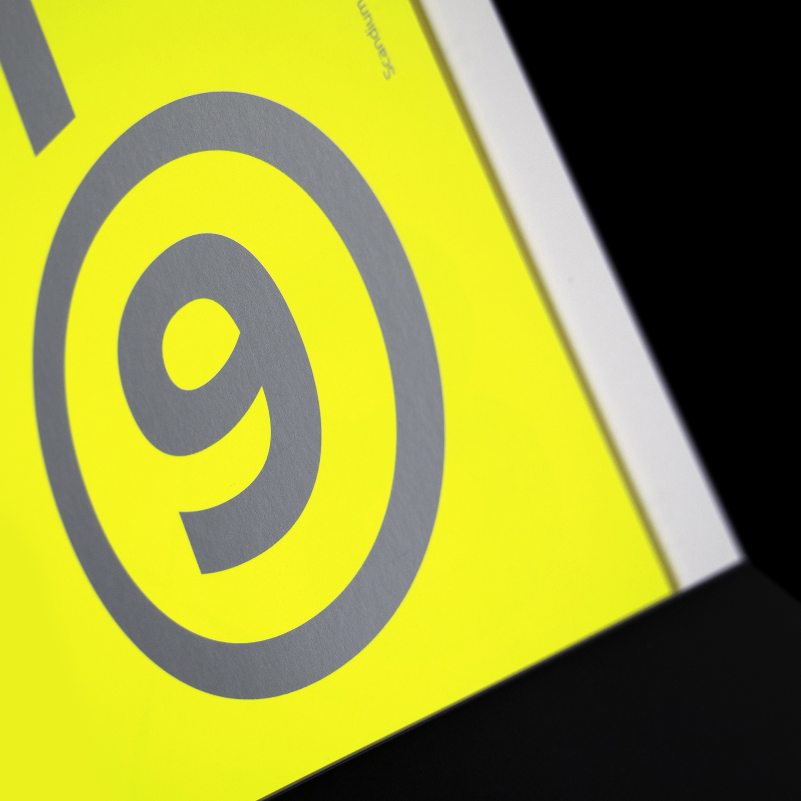
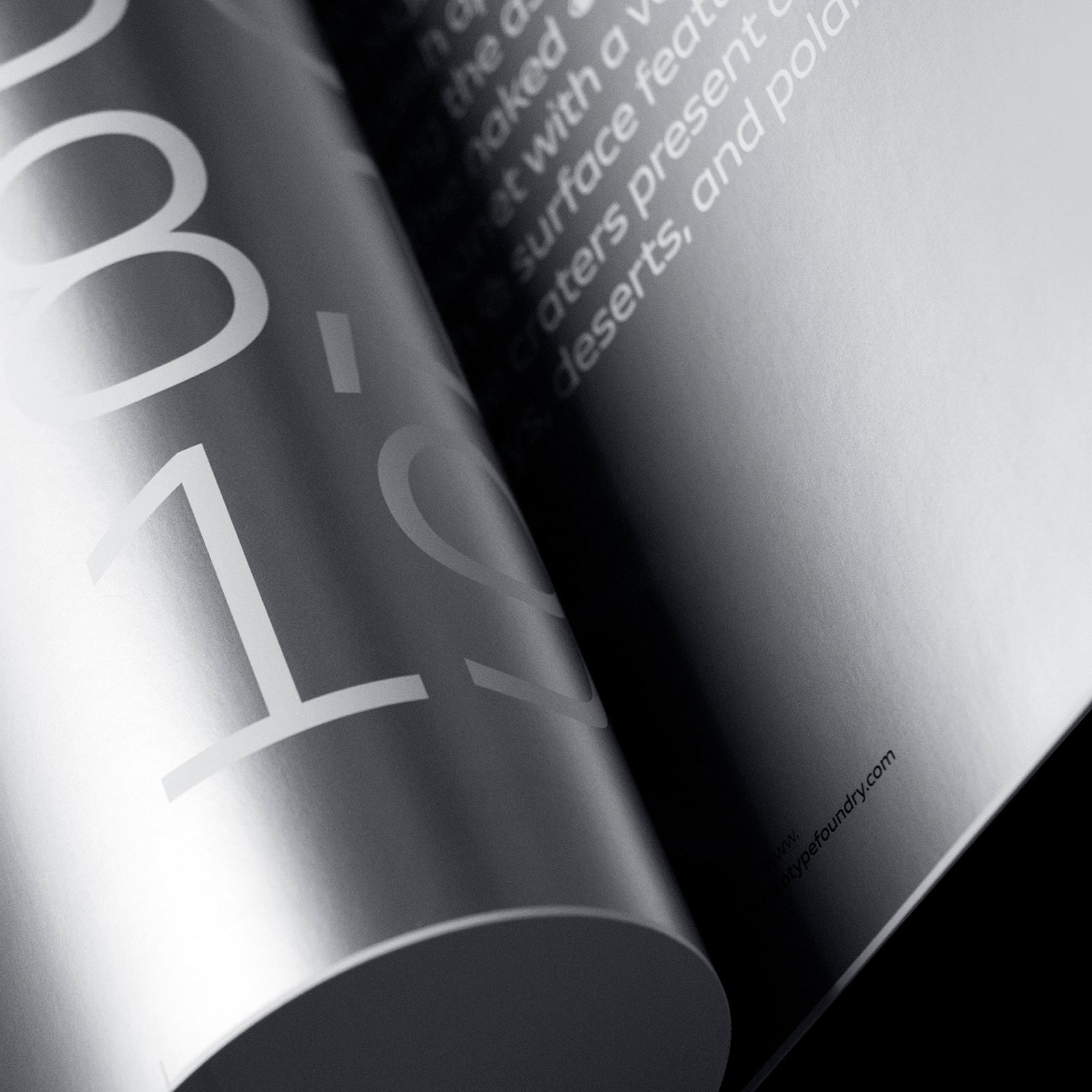
Scandium type specimen book reflects the contemporary functions and aesthetics of the Scandium type family. The theme of the Scandium Type Specimen Book is the redefined contemporary technology through the lens of the design values of this type family. The objective was to visually narrate all these key typeface characteristics to help designers and companies imagine what they might do with the typeface in their own projects. Semiotik, as part of the visual expression, incorporated materialism at different levels and from many perspectives. Different printing techniques, paper styles, sizes and volumes. The vibrant and tech oriented color system structures and unifies the cutting edge technological perception for this contemporary typeface.